Your brand.
Your language.
Your buttons.
Configuration is where the platform stops looking like a generic template and starts looking like yours — colors, logos, button labels, extra report types, and full multi-language support, applied globally or per community, no app-store release required.
Configuration at a glance
Two tools, one goal: make the Citizen App and Responder App feel like they were built for your organisation.
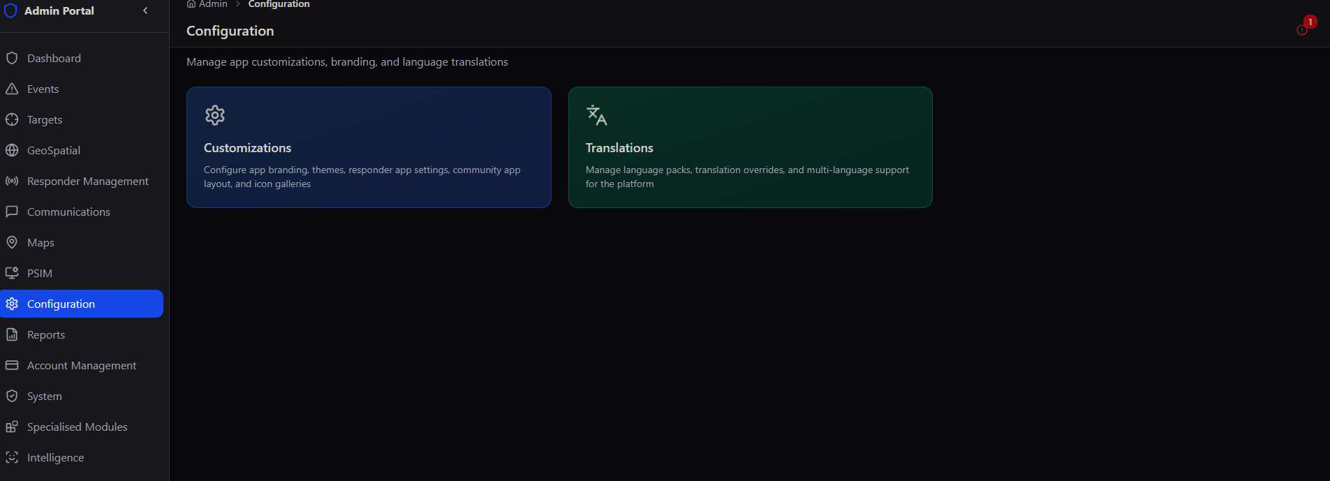
Every deployment of the platform serves a different organisation, community, or region — and each one wants its own look, its own report types, and its own language. Configuration puts every one of those decisions in the admin's hands instead of a developer's release cycle.
Global first, local second. Set a default look and language for the whole platform, then override colors, logos, or button sets for any individual community — a security estate can run its own branded app on the same underlying platform as everyone else.
App Customization
Set the default look of the Citizen App home screen — logo, colors, and animation — with a live preview as you go.
Customizations opens on six cards covering every corner of app appearance, from platform-wide branding down to per-community overrides and the buttons responders and citizens press every day.
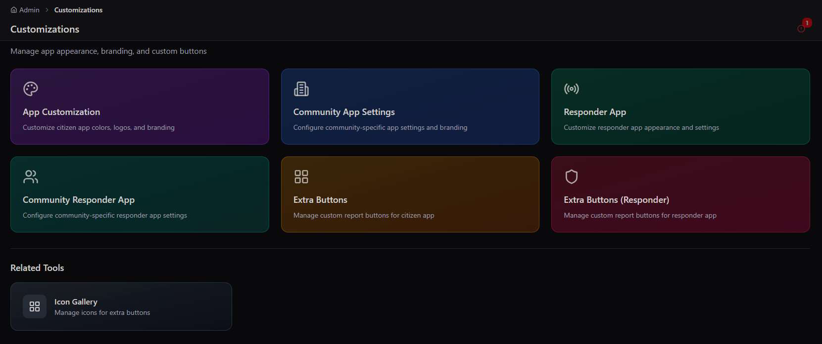
Logo, colors, and a live preview
App Customization controls the Citizen App's home screen at the platform default level — the look every community gets unless they set their own override. Upload a logo, scale it, add a subtle animation, and set the background and per-button colors, all reflected instantly in the phone preview on the right.
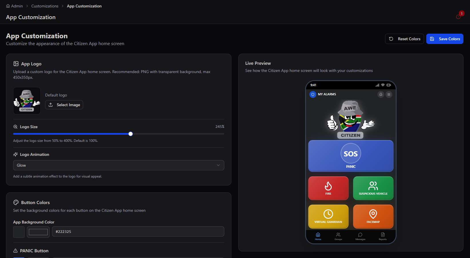
- App Logo — a custom PNG replaces the default AWE Citizen mark on the home screen (recommended 450×350px, transparent background).
- Logo Size — scale from 50% to 400% of default, useful for a wordmark logo that needs more room.
- Logo Animation — add a subtle Glow or other effect so the home screen doesn't feel static.
- Button Colors — set the app background color and the background color of every home-screen button (Panic, Fire, Suspicious Vehicle, and any Extra Buttons) individually.
Live Preview, always on. Every change to logo, size, animation, or color renders instantly in the phone mockup — nothing is applied to real users until Save Colors is pressed.
Per-Community Branding
Give any community — an estate, a ward, a business district — its own branded Citizen App, without touching the platform default.
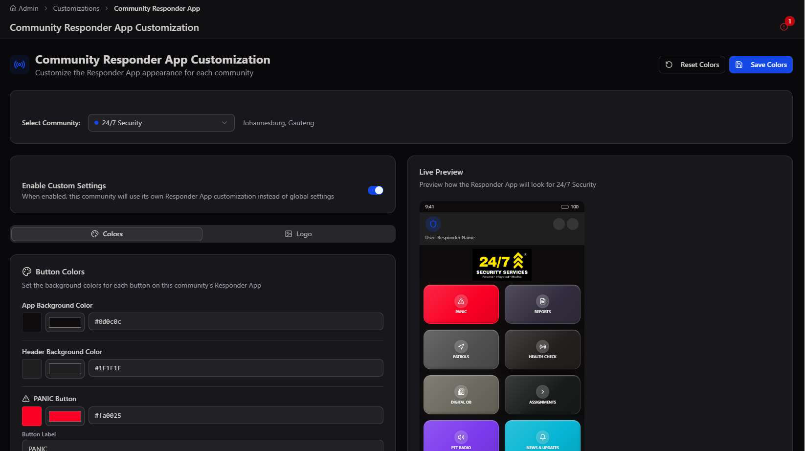
Community App Settings works the same way as App Customization, but scoped to a single selected community, with an Enable Custom Settings switch to opt that community out of the global look entirely.
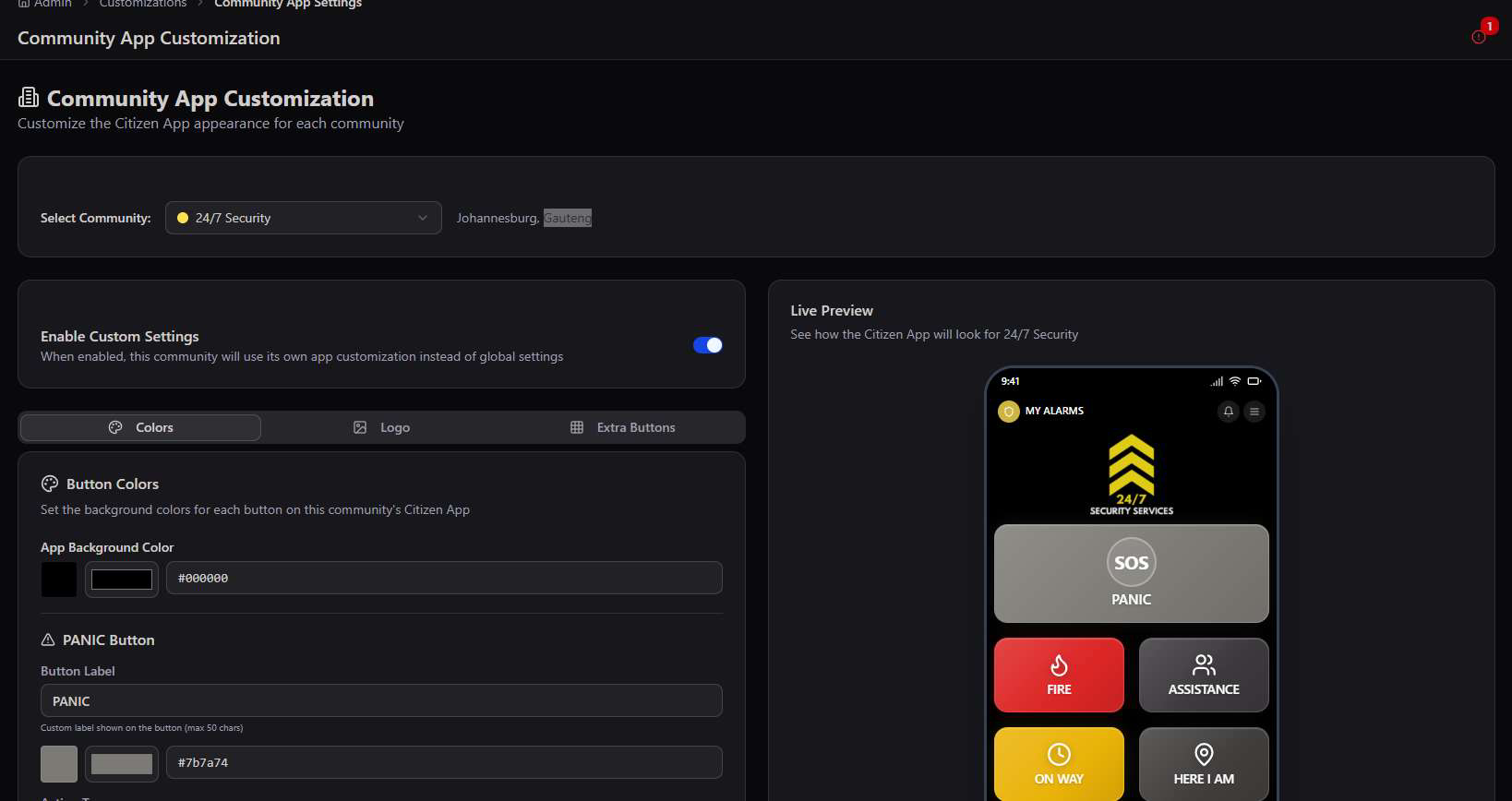
Once Enable Custom Settings is on, the same Colors / Logo / Extra Buttons tabs from App Customization apply — but only to that community's residents. Every other community keeps the platform default until they're switched over too.
Use case. A gated estate or private security firm with its own visual identity — like the "24/7 Security" example above — gets the app to feel like their own product, while still running on the shared AWE platform underneath.
Responder App Customization
The same branding controls, tuned for the Responder App's home dashboard — plus safety-critical interaction settings.
Responder App Customization mirrors the Citizen App tool, but themes the Responder home dashboard's grid of function tiles (Panic, Reports, Patrols, Health Check, Digital OB, Assignments, PTT Radio, News & Updates) instead of the citizen quick-actions.
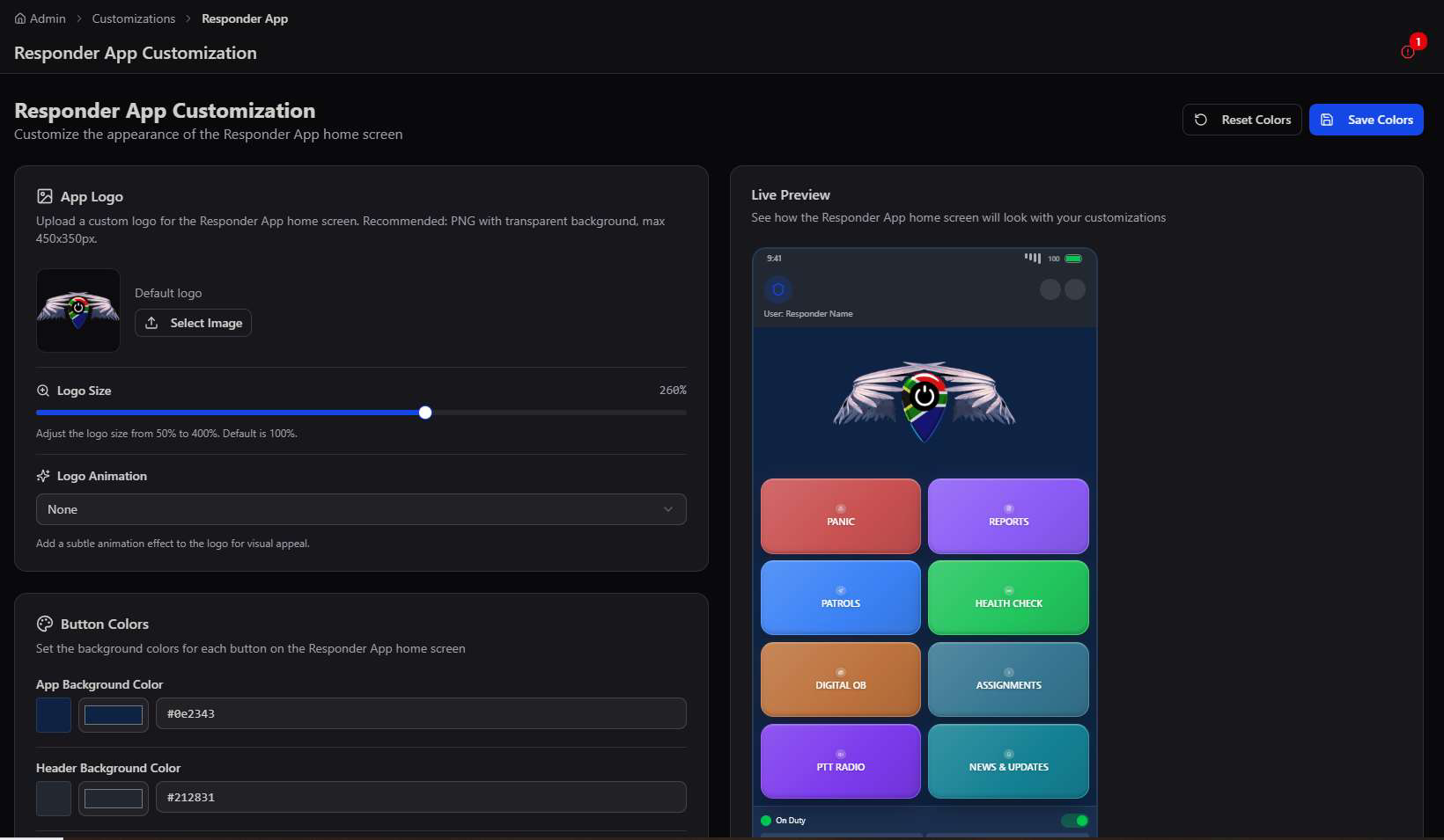
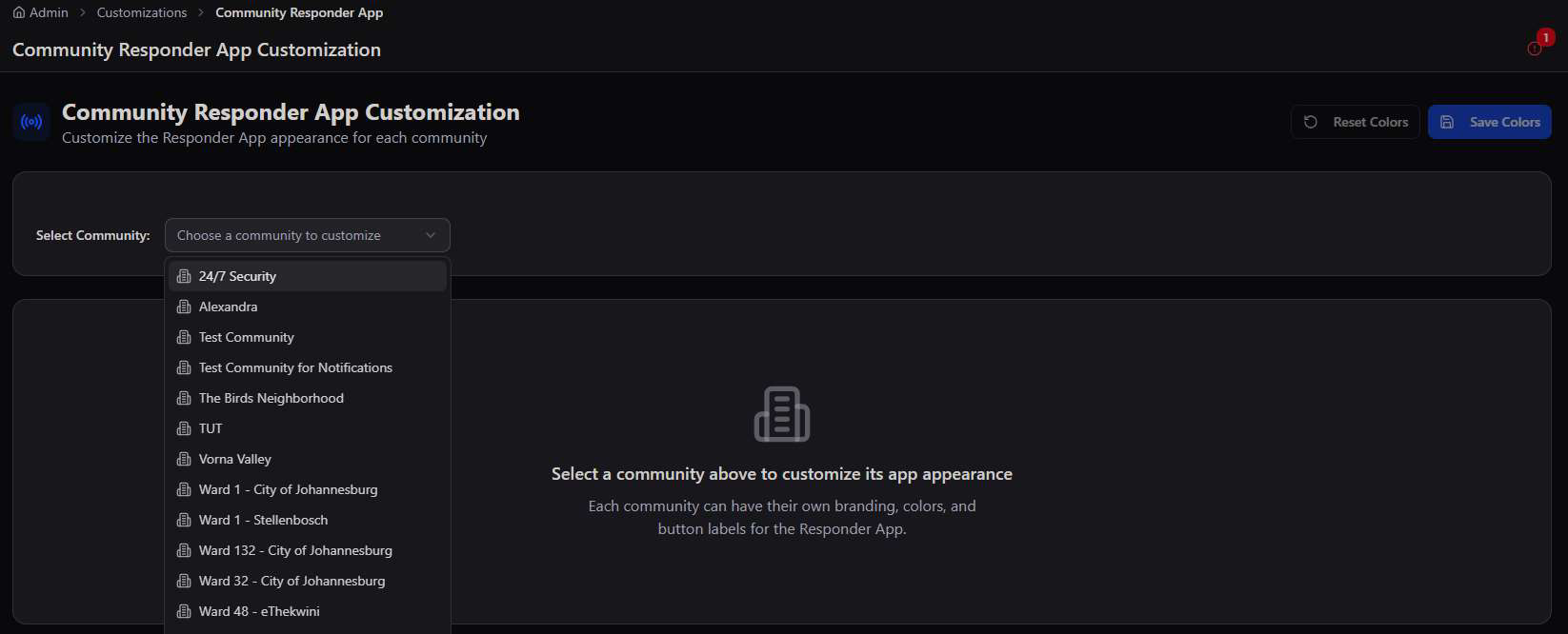
This is also where per-community Responder App branding lives, for teams that need their own patrol app look — reached via the Community Responder App card, with the same community picker and Colors/Logo tabs pattern used elsewhere.
Icon size, label size, and long-press protection
Beyond color, three settings tune how the dashboard actually behaves in the field — larger touch targets for gloved hands, bigger labels for readability in bright sunlight, and a long-press hold to stop a panic button firing by accident in a pocket or vest.
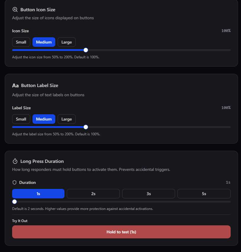
Field safety, not just style. Long Press Duration exists specifically to prevent accidental panic activations — the default of 2 seconds balances speed in a real emergency against false alarms from a bag or holster.
Extra Buttons
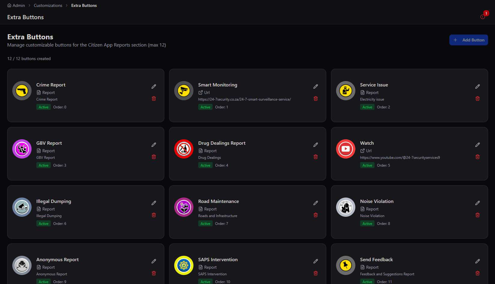
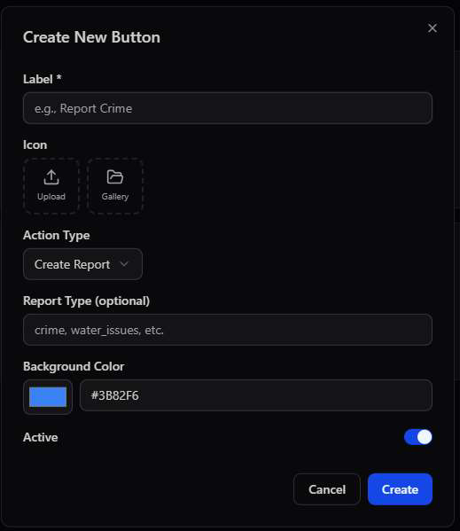
Add up to 12 custom buttons per app — each one wired to a report type, a URL, a phone call, an email, or a full integrated module.
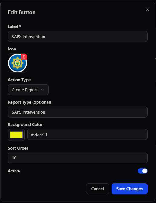
Extra Buttons is where the platform becomes genuinely configurable rather than just re-skinned. Every custom button gets a label, an icon, a background color, a sort order, and — critically — an Action Type that decides what actually happens when it's tapped.
Five action types
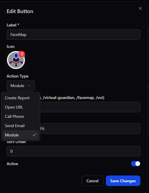
Admin RBAC rights allow any Extra Button to be wired to one of five action types — from a simple in-app report through to launching a fully separate specialised module:
| Action Type | What it does | Typical use |
|---|---|---|
| Create Report | Opens the standard in-app report form, pre-tagged with a report type | Crime Report, GBV Report, Noise Violation |
| Open URL | Launches an external link in-app or in the device browser | Smart Monitoring dashboard, YouTube channel |
| Call Phone | Dials a pre-defined number directly from the button | A control room hotline or estate security desk |
| Send Email | Opens a pre-addressed email, optionally with a subject template | Formal complaints or feedback routed to a specific inbox |
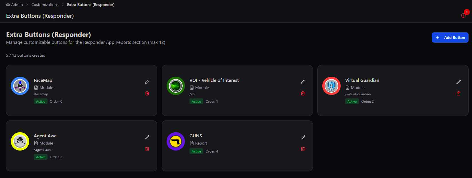
| Module | Deep-links straight into one of the platform's specialised modules | FaceMap, Virtual Guardian, VOI, Agent Awe, GUNS |
Need something more custom? If none of the five action types fit — a bespoke workflow, a third-party system integration, or custom logic beyond a report, call, or link — a fully customised module can be developed to your specification. Chat to our Dev Team to scope it out.
Responder App gets its own button set
Extra Buttons (Responder) works identically, but populates the Responder App's Reports screen instead — typically wired to Module actions that launch specialised field tools rather than citizen report types.
Icon Gallery
A shared, categorised icon library every Extra Button draws from — upload once, reuse everywhere.
Rather than uploading a fresh image for every button, the Icon Gallery keeps a searchable, categorised library — Emergency, Municipal, Community, Transport, Utilities, Security, Health, and Other — so a consistent icon set can be reused across every community's buttons.
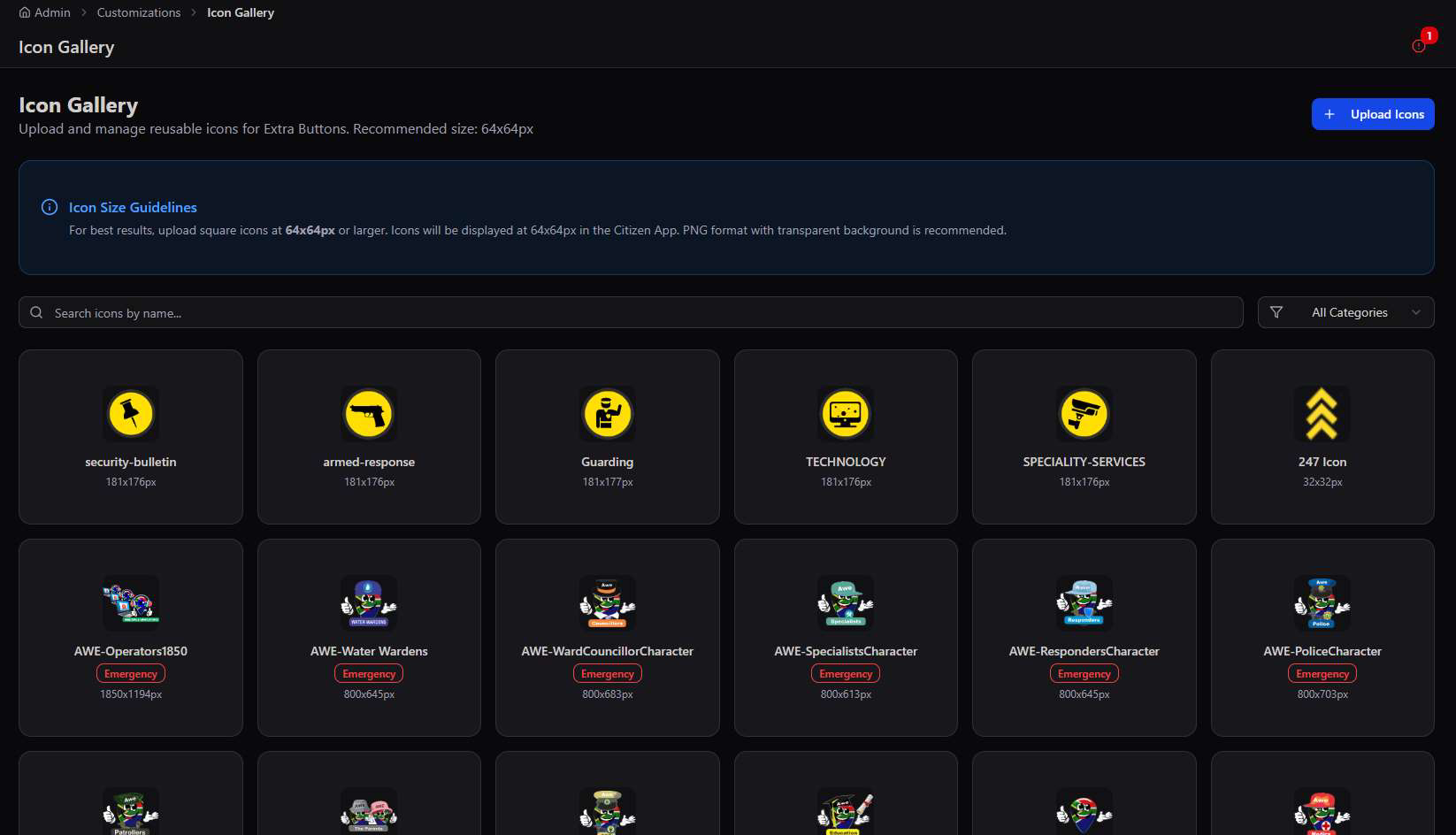
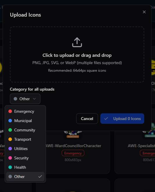
Recommended size. Upload square icons at 64×64px or larger — they render at 64×64px in the Citizen App regardless of source size, and PNG with a transparent background looks cleanest against colored button backgrounds.
Translations
Every label, alert, and message in the platform, in four languages — with custom overrides and bulk import/export.
Translation Management covers the platform's full string table — 1,425 translation keys across English, isiZulu, isiXhosa, and Afrikaans — organised by category so a specific screen's copy can be found and adjusted without wading through the whole set.
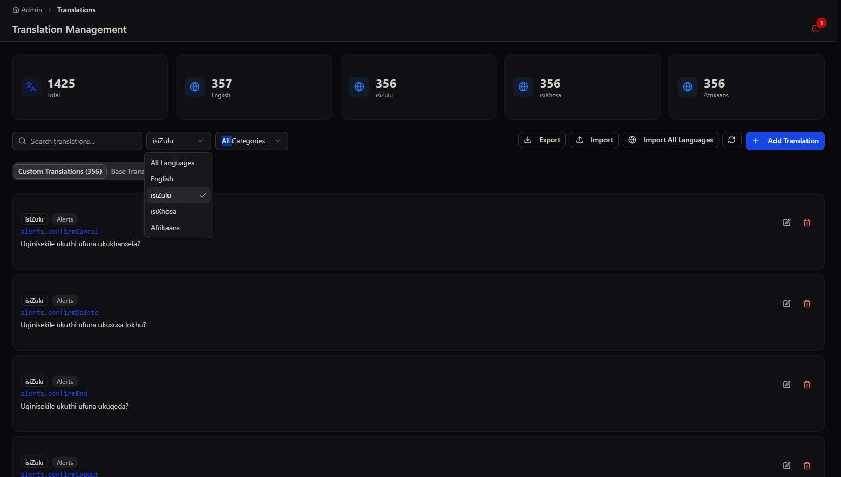
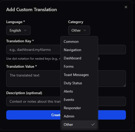
Dot-notation keys. Every string is addressed like alerts.confirmCancel or dashboard.myAlarms — nested by screen and context, so the same key resolves consistently across languages and stays stable even as wording changes.